A common scenario – you have measured CPU on your servers for the past few months. CPU has been steadily growing, and you want to predict how soon you will need to buy new servers. You need to forecast. But how? The aim of this post is to go over the simplest way to build a forecast and to show how to do it in Microsoft Excel.
Forecast method 1 - Guess
Let’s qualify that; there is one method that is even simpler than the one we’re going to look at in a way – just guess.
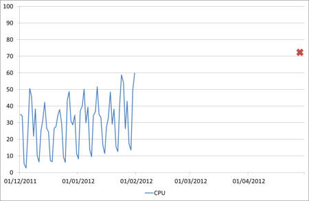
We have this data set which is supposedly the CPU of one of our servers over the past couple of months – what is the peak going to be in April?
Well that red cross on the graph is my guess. About 73% busy. No calculations, no formulae, no statistics, just looking at the graph and making a guess. And it’s quite convincing to me, if CPU keeps growing in the same way I expect it will reach that. It would save a lot of time and effort if everyone else was as convinced.
But as well as convincing everyone else, I need a way of automating that guess, so I don’t have to keep looking at the same graph and making a new guess every month. That is what forecasting is about.
Forecast method 2 – Linear Regression
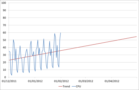
Everyone will have seen linear regression forecasts of some sort. Many tools will produce them for you, or you can put your data into an Excel chart and tell it to draw a ‘Trendline’. Here is the same data with a trend line example
That looks a lot more scientific. We can see that the trend there matches the trend of the historic data and following that forward we can see what the CPU will be by the end of April: 55%. Now that is a lot less than our guess of 73%. Oh, and it’s also less than our current peak value of 60%.
While this is a method that is commonly used, it takes no account of the variation present and so is often worse than useless as it dresses itself up as a ‘forecast’. It is telling us something about the data, but in this case where there is a fairly typical weekly profile it is only telling us part of the story.
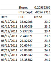
It does have an advantage over the ‘guess’ method in that it can be automated, and very simply in Excel.
This uses the slope formula =SLOPE(B5:B66,A5:A66) and the intercept formula =INTERCEPT(B5:B66,A5:A66). The trend can then be calculated as =A5*C$2+C$3 (multiplying the date by the slope and then adding the intercept).
Forecast method 3 – Time Series Decomposition (TSD)
In order to get a realistic forecast we need to take into account all of the components of the historic data, not just the trend. The most important one, because it can be predicted in some measure, is the seasonality.
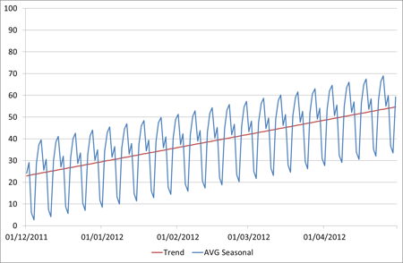
What we do is take the trend that we calculated using Linear Regression above, and then also take the average seasonal component, and stack them on top of each other – something like this:
In this case we have a repeating pattern every week. Of course the seasonality period may vary but we’ve chosen a week here as that was the fairly obvious pattern in the original data. To get a repeatable seasonality value for each day we’ve taken the averages – i.e the average difference from the trendline on Sundays, the average difference from the trendline on Mondays, etc. Then every Sunday/Monday/etc in the future we simply apply the same seasonal adjustment.
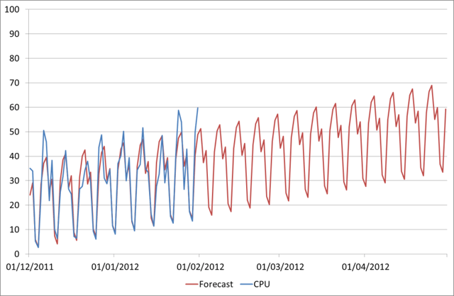
So here is our new forecast alongside our actual historical data:
This gives us a peak April figure of 69%, which looks much more realistic than 55%, and is also fairly close to our first prediction (guess) of 73%.
How do we produce this combined forecast in Excel? It’s quite straightforward and can be done without any pivot tables or anything like that.
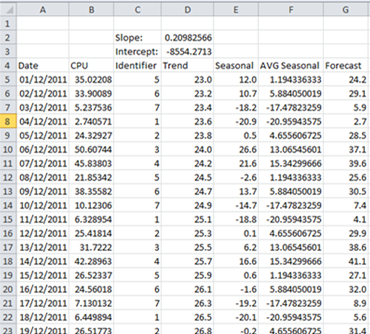
Here are the columns that we will use. CPU is the original data, Trend we have already seen is calculated using the Slope and Intercept values. The extra columns we have now are
- Identifier: This defines the seasonality we are using. Since we are doing weekly seasonality I’ve simply used the WEEKDAY function to make a unique identifier for each day of the week
- Seasonal: This is the seasonal component of the historical data. This is calculated simply by subtracting the Trend from the CPU (e.g. =B5-D5)
- AVG Seasonal: The average seasonality which will be defined into the future. To calculate the average for that particular weekday I’m using the SUMIF and COUNTIF functions, e.g =SUMIF(C$5:C$66,C5,E$5:E$66)/COUNTIF(C$5:C$66,C5)
- Forecast: This is where the two components come back together – we simply add the AVG Seasonal figure to the trend (e.g. =D5+F5)
Now we could make this forecast even better by also factoring in the error component, as even with the seasonality there is some behaviour we are not capturing. I’ll include this in a second article and post a link to the sample Excel file as well once I’ve finished it.
If you would like to learn more about Capacity and Performance Management - download our primer here.
