

Blogs
Date 29 June 2026
Have you ever wondered how Excel calculates that nice trend line in your not so perfect data? I’m guessing not and that you take it for granted, and hand in reports without actually knowing the statistics and mathematics in the background. Below I detail how this works and give a worked example in Excel.
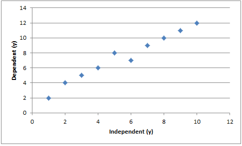
When gathering data we usually gather the data based on dependent and independent variables. X is usually the independent variable and y is usually the dependent variable. What we can do is take these x and y values and plot them against each other and generate a graph.
And generate something like this:
Now it’s clear we can see a pattern here. But how do we put a line over these values so that all points are considered equally? Well the answer is that we often use “least squares” fit.
The function of the best fit line to fit each datum: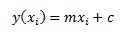
Thus we can consider the difference between the line and each datum: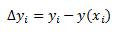
For real data it could be either positive or negative. Because it may be negative we have to square it. Hence the “least squares” fit. When we sum all of these we can find a minimum for the line of best fit. We then normalise each datum by its uncertainty σi.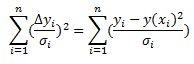
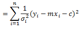
Taking partial derivatives: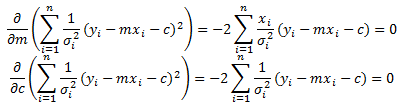
From this we can generate 2 simultaneous equations: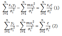
These can be easily solved by some matrix manipulation: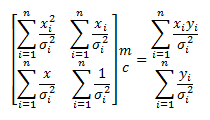
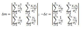
It follows that: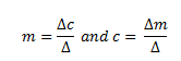
So now we have covered that we are going to look at how it can be applied.
I am going to use the first graph as an example. In Excel I am going to tabulate up values and from this calculate all the values required. 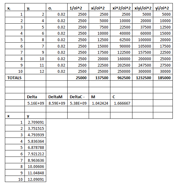
From above we can see that the line of least squares should be y=1.042424x+1.666667. Plotting this with the initial line gives the below: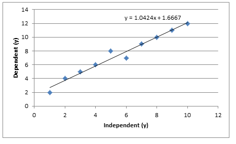

About the author
Team Capacitas

FinOps and AI: Financial Discipline for Enterprise AI
Learn how FinOps extends to enterprise AI, connecting financial, technical and product decisions to manage spending and measure returns. blogs-(new)-post

Confidence Under Load: How We Verified AKS Readiness for Peak
How Capacitas verified AKS readiness for peak demand by validating workload performance, autoscaling, cluster capacity, monitoring, and incident response. blogs-(new)-post

Building Cloud Resilience: Lessons from the AWS Outage
Learning from the Latest Outage. Events like this week’s AWS disruption highlight one clear truth: resilience must be designed, not assumed. blogs-(new)-post
Bringing Order to Chaos: A Practical Guide to Chaos Testing in the Cloud
Build a structured approach to cloud chaos testing with the right tools, realistic failure scenarios, clear hypotheses and focused analysis of results. blogs-(new)-post